Nordnet - Order Panel
Nordnet - Order Panel
Nordnet - Order Panel
Role
Product Designer
Duration
Start 2020 · 8 weeks
Redesign 2023 · Innovation day
Tools
Sketch, InVision, Abstract, Figma
Responsibilities
· Discovery and requirements gathering
· Competitor analysis
· Wire-framing
· Usability testing and validation
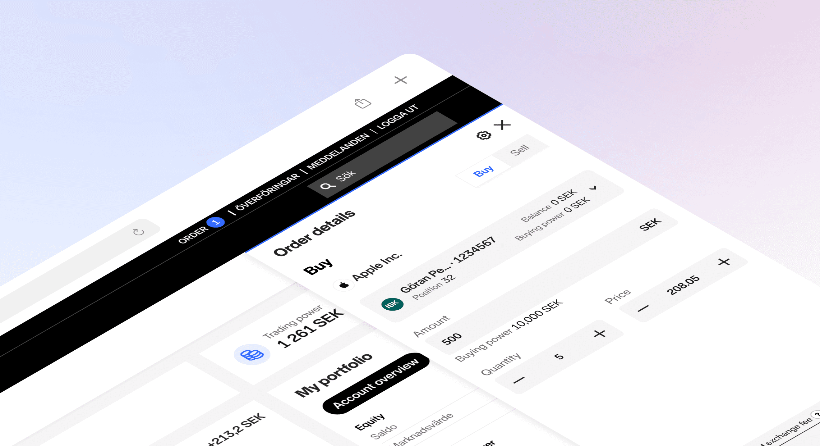
About Nordnet
Nordnet is a leading Nordic digital platform for savings and investments with a purpose of democratise savings and investments. Through innovation, simplicity and transparency, Nordnet challenge traditional structures and give private savers access to the same information, tools and services as professional investors. With innovative UX, groundbreaking financial products and automated and inspiring customer journeys.
Project overview
During 2019-2020 Nordnet started a re platforming journey. A lot of features was missing on the new platform. When our customers placed an order they did not know what happened to it.
Is it filled, is it in the market or is it waiting for the market to open? This created a big frustation among or customers.
The possibility to also be able to access and see the status anywhere on our desktop view was not possible either. That's how this whole project started, and my goal was to create a feature that would help our customers easily access their orders and trades.
Problem & Opportunities
· Simplify the order flow.
· Customers don't understand what happens to their orders.
· Customers want an overview of existing orders and when they place a new order.
· Give the customers an overview of their current orders where they also could place and modify their orders and trades anywhere on the web.
By solving this problem there's an opportunity to increase the numbers of trades, and letting the customers trade in relation to the page.
Research
During the empathy stage of my project, I focused on understanding the emotions that our customers experience while using the current order flow. This is important because emotions drive behaviours and motivations. In particular, I discovered that the most significant frustration was a lack of trust, which is especially critical for a financial business since we deal with people's money.
Customers felt this way because they didn't know what happened to their orders and trades after they placed them in the market. This lack of transparency made them hesitant to place additional orders or modify existing ones. To address this issue, I explored how to align customer frustrations with stakeholder requirements:
· Simply the order flow
· Help customers understand what is going on with their orders and trades
· Give them a good overview where they can modify their orders
· Increase the number of trades
To gain further insights, I also consulted with the analytics team to understand how customers are interacting with the existing holdings page, instrument page and orders and trades page. This helped me to better understand user behaviour and identify areas for improvement.
After synthesising all of this data, I moved on to lay out problem and hypothesis statements. To further inform my analysis, I conducted a competitive audit through secondary research.
Overall, this comprehensive approach allowed me to develop an understanding of our users and their needs, as well as the strengths and weaknesses of the existing trading experience.
Target groups
Saver
Does not know anything or very little about savings and investments
Does not understand what is happening when trading
Does not know how to trade
Has an account but not many securities or none at all
Feels insecure about trading because of lack of knowledge
Makes 0-10 trades per year
Investor
Knows how to save but do not trade
Is aware of how to place an order and what happens but might need a bit of guidance
Buys regularly
Have several accounts
knowledgeable about the market
Does not feel save not knowing where their orders and trades went
Makes 11-500 trades per month
Trader
Trading as an income
Very active
Uses several platforms for trading
Want to be able to access order depth and latest trade for their orders anywhere on the web
Feels frustrated when not being able to get a good overview of their orders and trades
Makes more than 500 trades per month
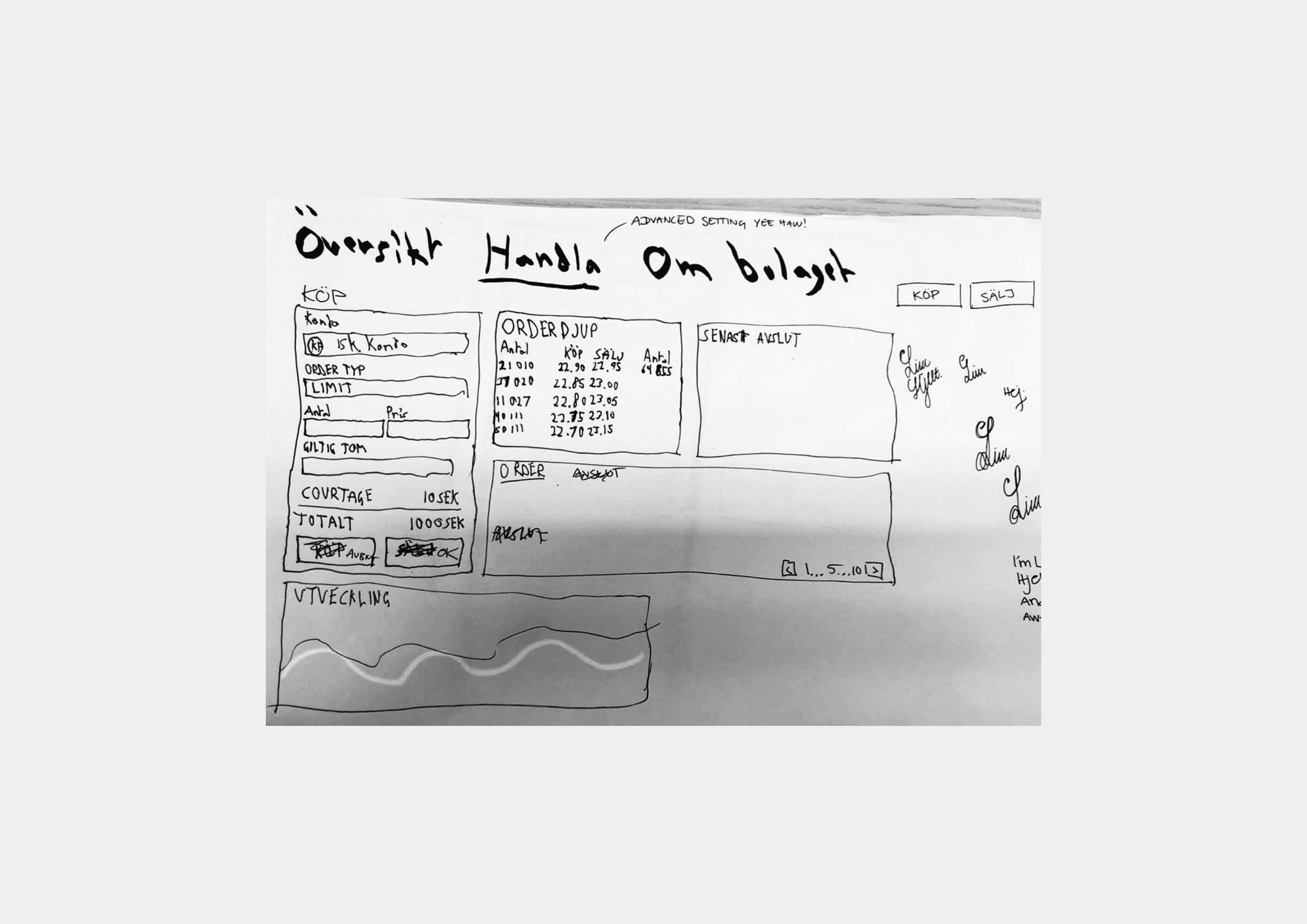
Sketches - Concept one
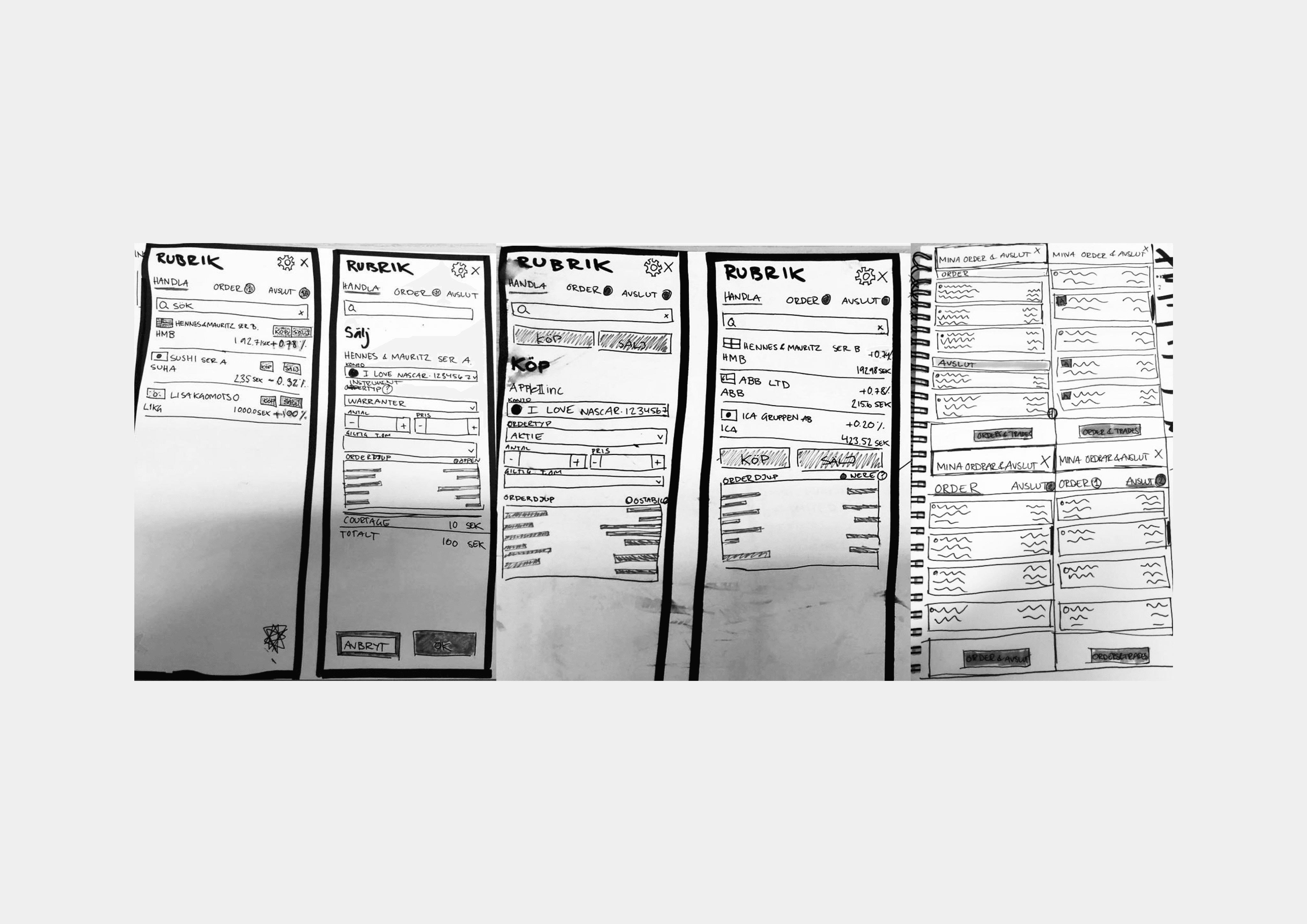
Sketches - Concept two
Ideation, user testing & iteration
In the early stages of my design process, I began by sketching out two different ideas for improving our trading platform. The first concept aimed to add more information to the instrument (stock) pages to create a more traditional trading view and experience based on feedback from user interviews. However, after careful consideration, I decided not to pursue this idea because it didn't allow customers to trade in relation to the page.
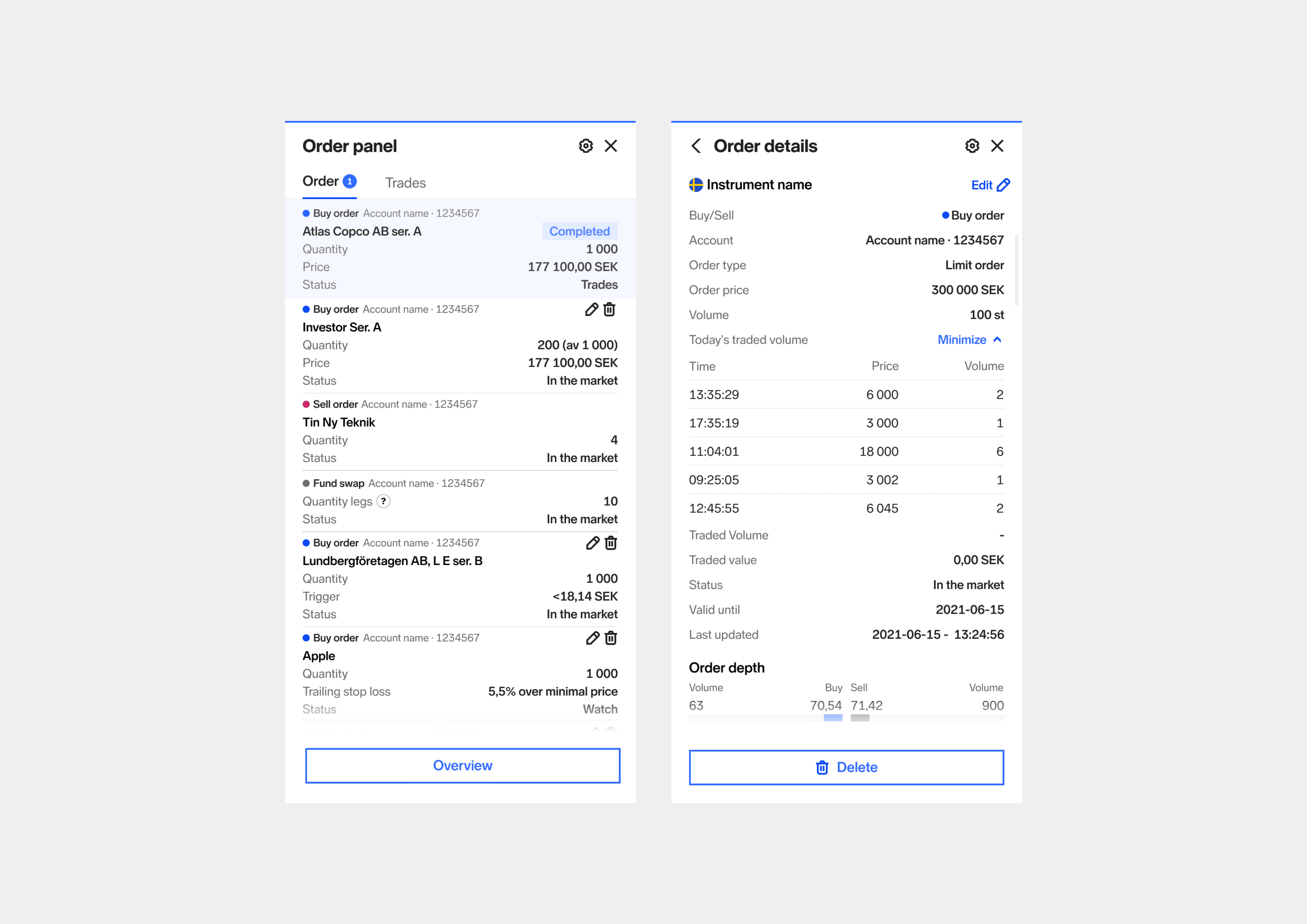
The second concept I came up with was to create an "order panel" that would give users an overview of their orders and trades from anywhere on the web, accessible through the main header component. With this panel, users would be able to check the status of their current orders and trades and modify them if necessary.
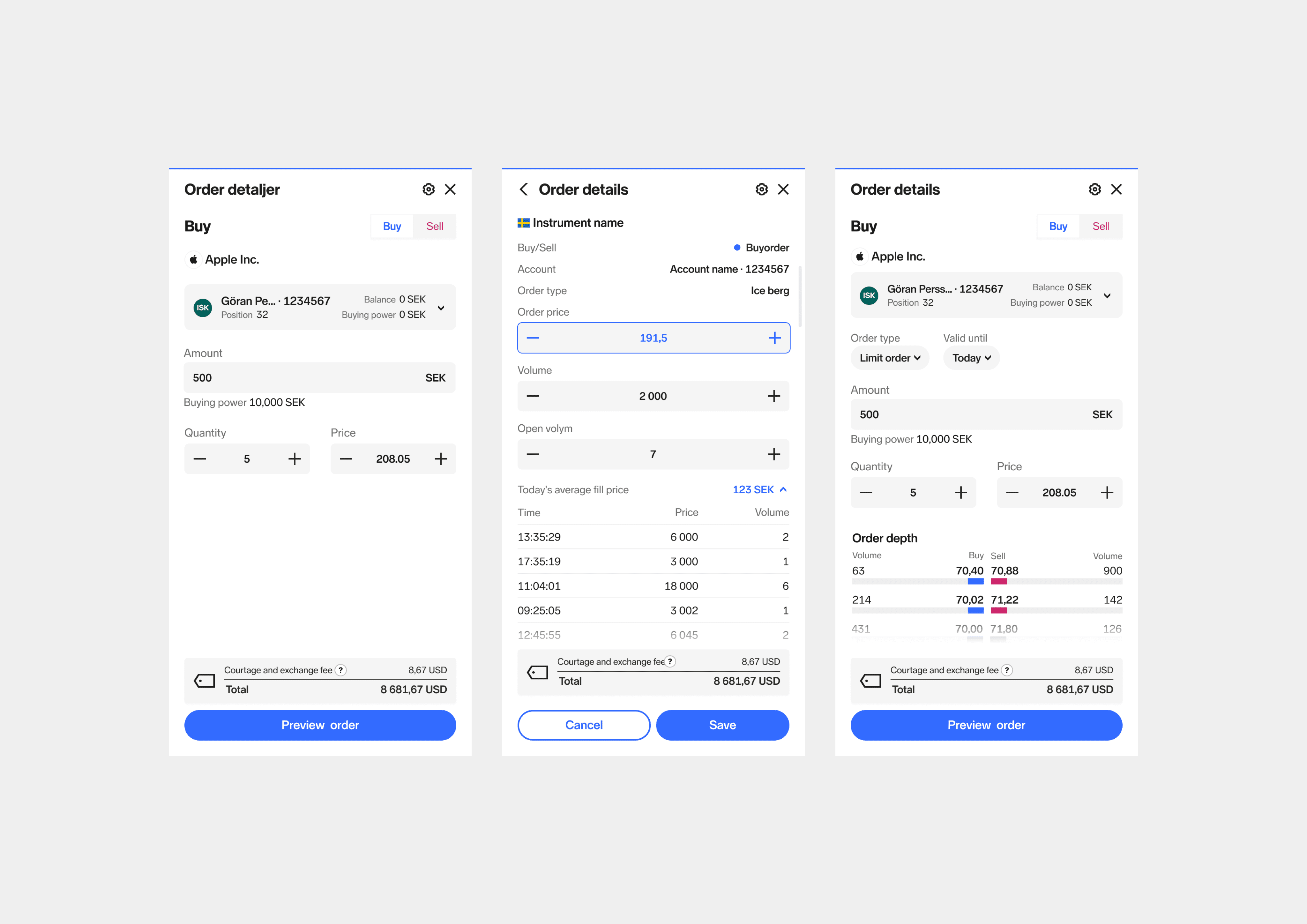
As I iterated on this idea, I drew inspiration from e-commerce patterns, specifically the "add to cart" feature. I realised that we could enable users to buy and sell holdings from anywhere on the website, which would increase the number of trades and improve the user experience. This led me to refine the design further and develop a more comprehensive solution that would address our users' needs and improve our trading platform.
By starting with paper sketches and iterating on my ideas, I was able to develop a more user-centered approach that would ultimately lead to a more successful and effective solution.
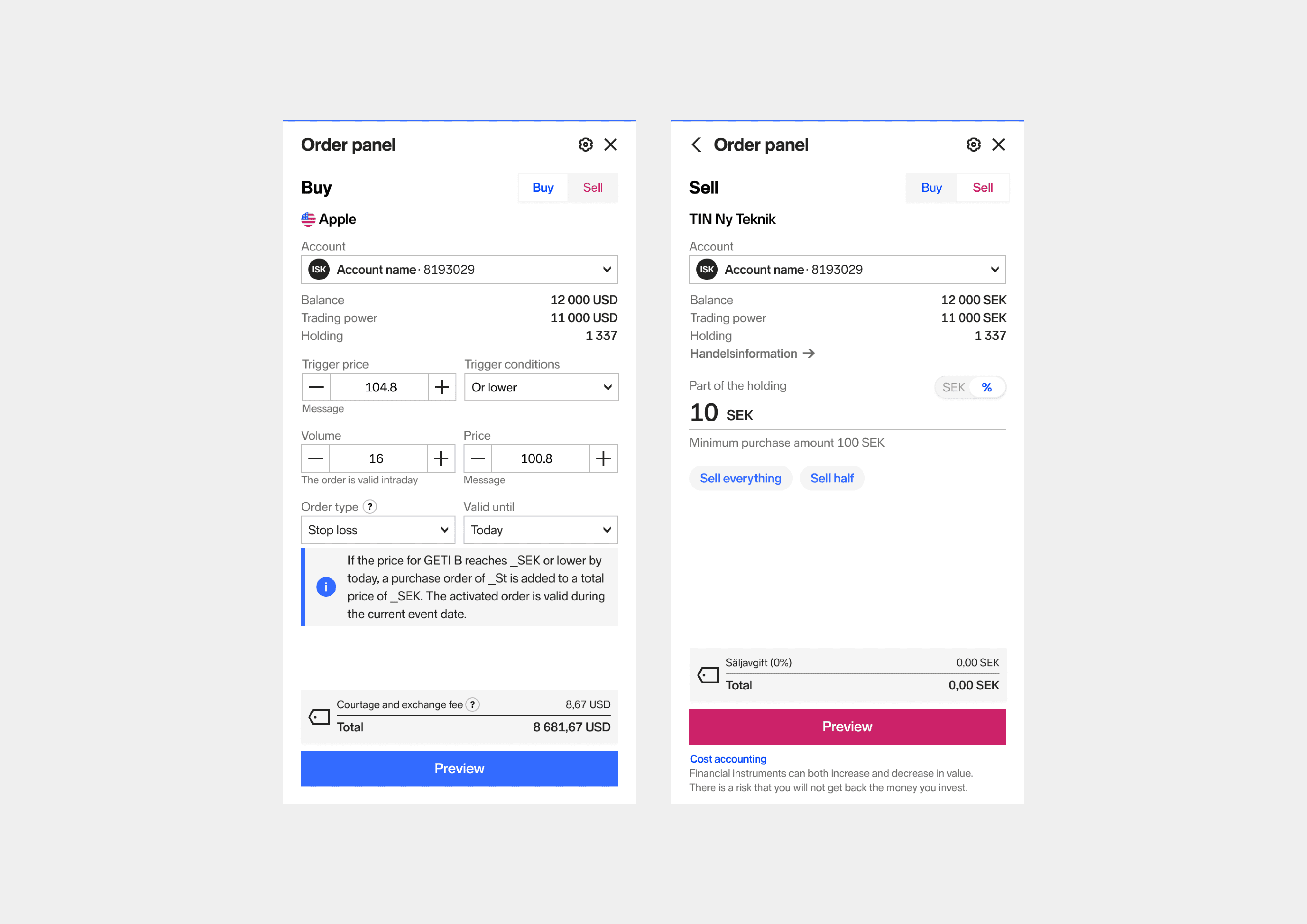
Buy view for a stock and sell view for a fund
Order list and order details where a customer can modify their order
Outcome
Since the release of the Orderpanel, users have been pleased with the result.
They no longer need to navigate to a specific page to get a better overview of their orders and trades. With the ability to delete and modify orders quickly and easily, users can make changes without leaving the current page they're on.
Additionally, they can get key information about a stock they have placed in the market, such as order depth and the latest trade.
As the feature gained popularity, we received new feature requests from users, which we implemented and tweaked accordingly. These include a button to quickly place the same order again and a preview option before purchase (primarily for the saver group).
While the Orderpanel has been successful, we still have features to implement in the future. For example, we plan to add panel settings that allow users to edit the order of the order list. As with any design project, there is always room for improvement, and we will continue to iterate and evolve the Orderpanel based on user feedback and emerging needs.
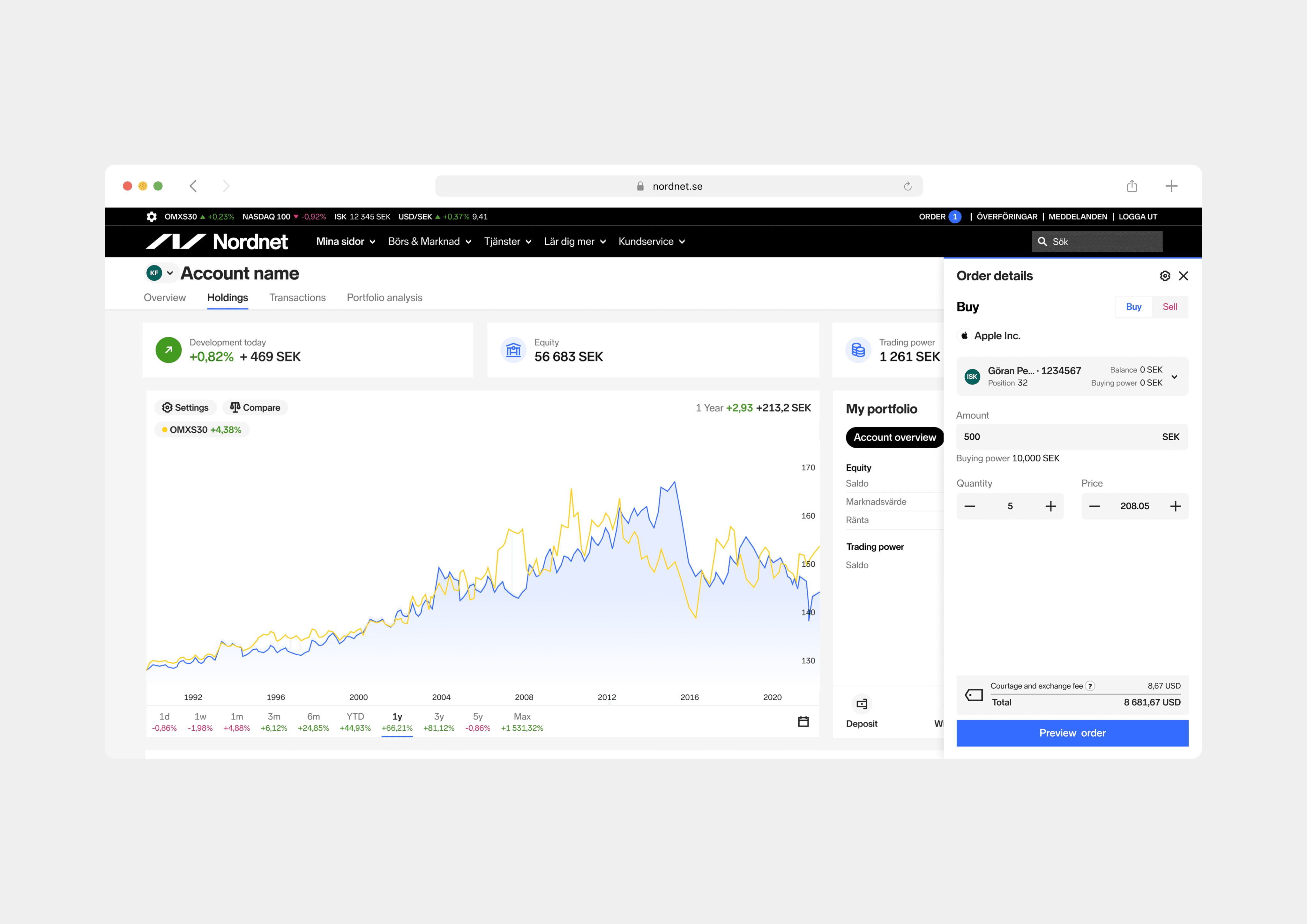
New improvements 2023
During one of our innovation days, I took the opportunity to give the Order panel a fresh update. First, I revamped the look and feel of the UI, giving it a more modern design. Then, I implemented an idea I had from the beginning of the project (that never made it due to stakeholder prioritisation), which was to cater to less advanced customers, specifically savers. I created a simplified trading view that removes elements that are not relevant for customers who only want to place a limit order.
By removing unnecessary elements, it reduces cognitive overload for less experienced customers.
This would also help the new business goals for Nordnet where we try to capture less experienced and new users into our product.
To help determine which mode is most suitable for first-time users, I also designed a short onboarding flow. For existing customers, I added a "discover tooltip" to guide them to the Order panel settings, where they can easily switch between the modes at any time. These changes have been well-received by internal stake holders and a few customers who've been shown the designs.
We will continue to gather feedback and make further improvements as necessary to ensure that the Order panel remains user-friendly and meets the needs of our diverse customer base.
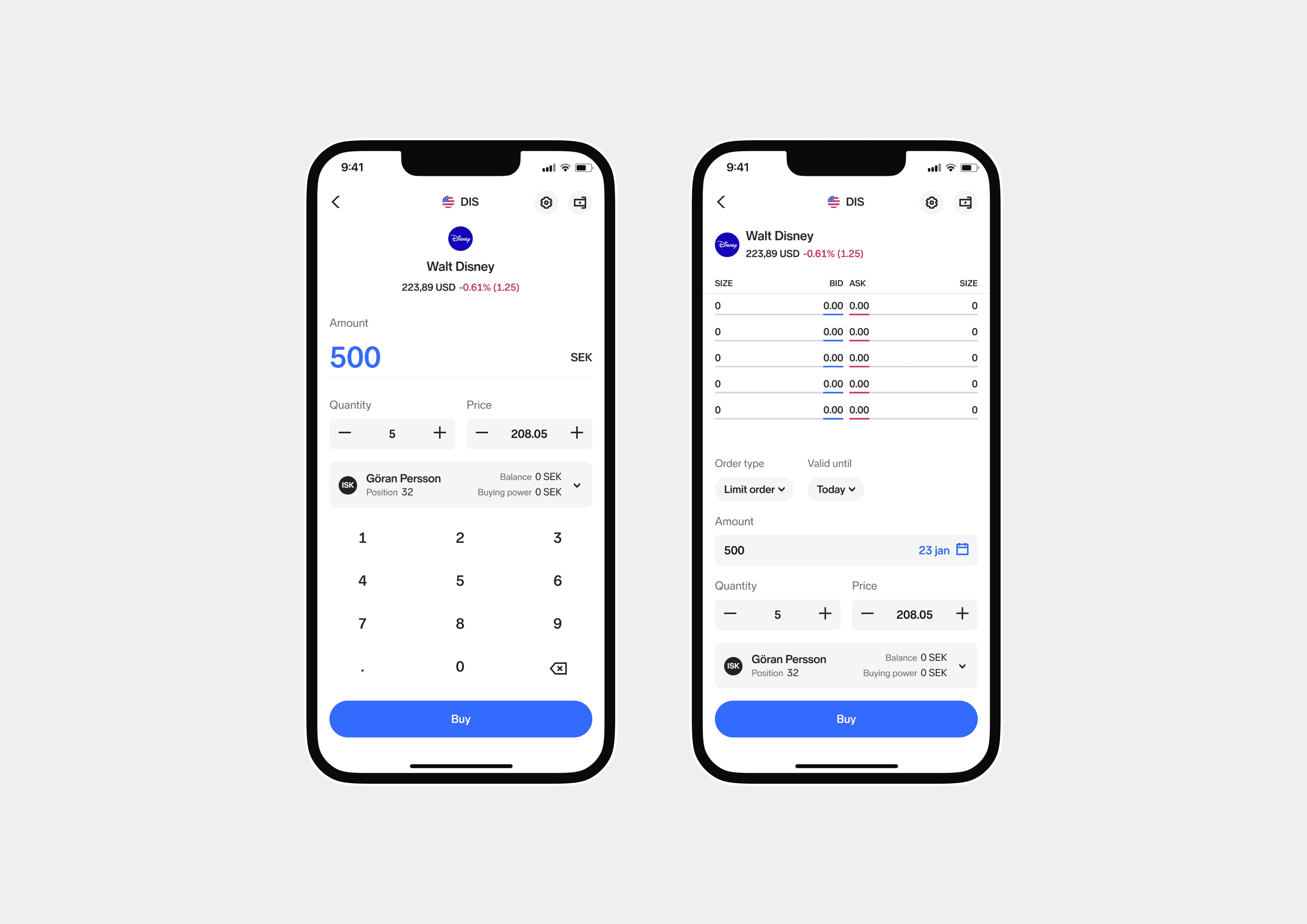
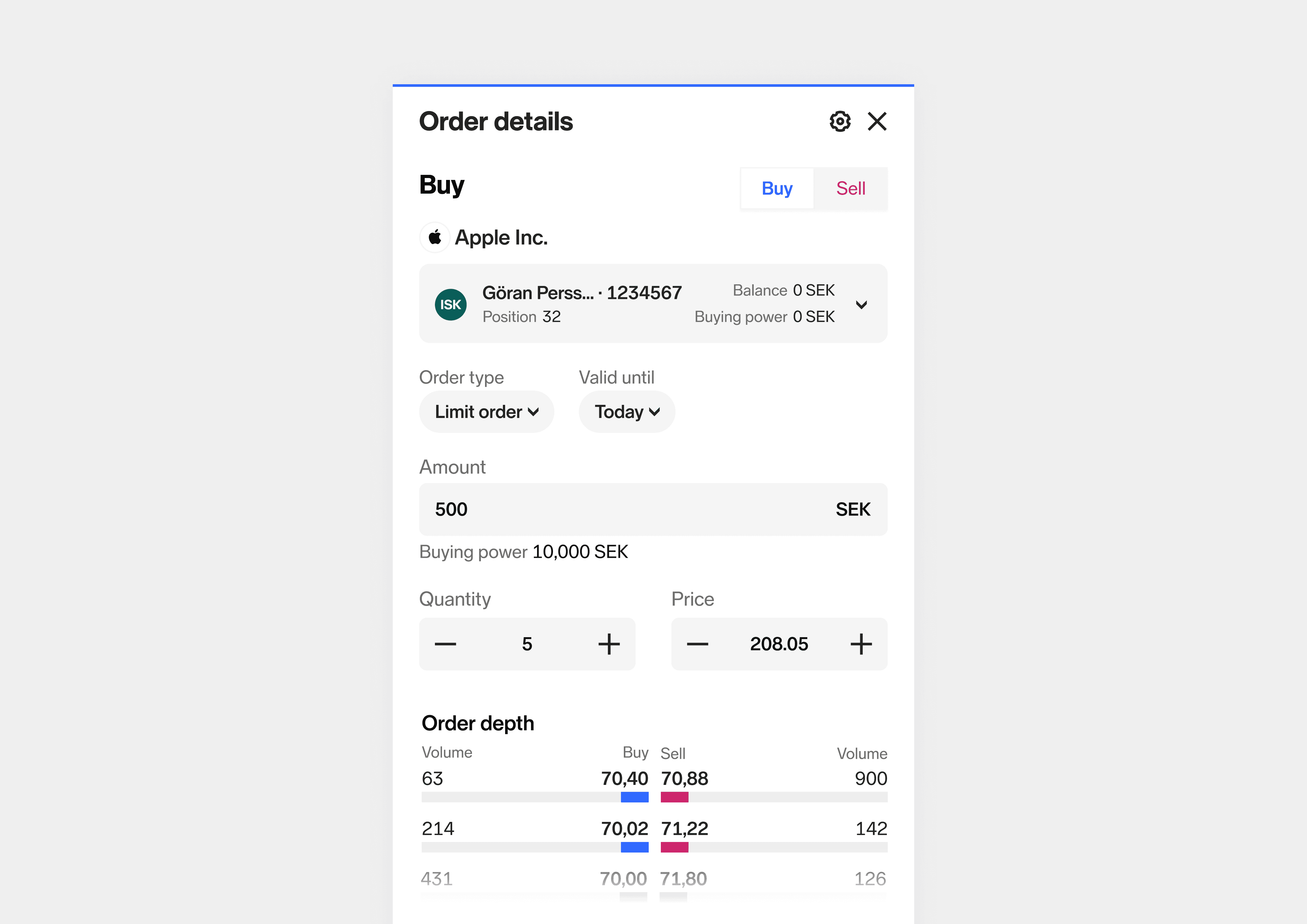

App
New UI
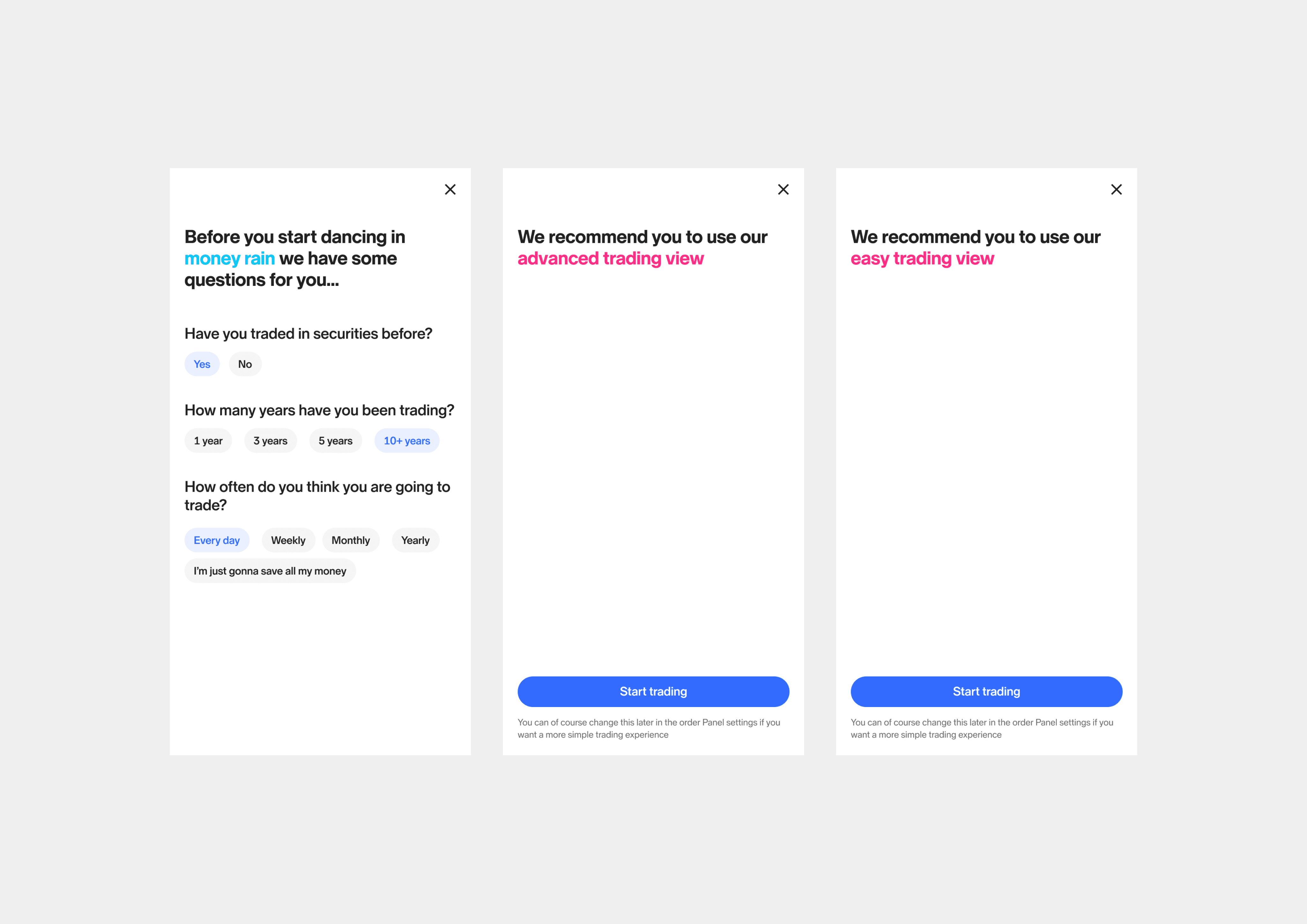

Onboarding view
Close up
Role
Product Designer
Duration
Start 2020 · 8 weeks
Redesign 2023 · Innovation day
Tools
Sketch, InVision, Abstract, Figma
Responsibilities
· Discovery and requirements gathering
· Competitor analysis
· Wire-framing
· Usability testing and validation

About Nordnet
Nordnet is a leading Nordic digital platform for savings and investments with a purpose of democratise savings and investments. Through innovation, simplicity and transparency, Nordnet challenge traditional structures and give private savers access to the same information, tools and services as professional investors. With innovative UX, groundbreaking financial products and automated and inspiring customer journeys.
Project overview
During 2019-2020 Nordnet started a re platforming journey. A lot of features was missing on the new platform. When our customers placed an order they did not know what happened to it.
Is it filled, is it in the market or is it waiting for the market to open? This created a big frustation among or customers.
The possibility to also be able to access and see the status anywhere on our desktop view was not possible either. That's how this whole project started, and my goal was to create a feature that would help our customers easily access their orders and trades.
Problem & Opportunities
· Simplify the order flow.
· Customers don't understand what happens to their orders.
· Customers want an overview of existing orders and when they place a new order.
· Give the customers an overview of their current orders where they also could place and modify their orders and trades anywhere on the web.
By solving this problem there's an opportunity to increase the numbers of trades, and letting the customers trade in relation to the page.
Research
During the empathy stage of my project, I focused on understanding the emotions that our customers experience while using the current order flow. This is important because emotions drive behaviours and motivations. In particular, I discovered that the most significant frustration was a lack of trust, which is especially critical for a financial business since we deal with people's money.
Customers felt this way because they didn't know what happened to their orders and trades after they placed them in the market. This lack of transparency made them hesitant to place additional orders or modify existing ones. To address this issue, I explored how to align customer frustrations with stakeholder requirements:
· Simply the order flow
· Help customers understand what is going on with their orders and trades
· Give them a good overview where they can modify their orders
· Increase the number of trades
To gain further insights, I also consulted with the analytics team to understand how customers are interacting with the existing holdings page, instrument page and orders and trades page. This helped me to better understand user behaviour and identify areas for improvement.
After synthesising all of this data, I moved on to lay out problem and hypothesis statements. To further inform my analysis, I conducted a competitive audit through secondary research.
Overall, this comprehensive approach allowed me to develop an understanding of our users and their needs, as well as the strengths and weaknesses of the existing trading experience.
Target groups
Saver
Does not know anything or very little about savings and investments
Does not understand what is happening when trading
Does not know how to trade
Has an account but not many securities or none at all
Feels insecure about trading because of lack of knowledge
Makes 0-10 trades per year
Investor
Knows how to save but do not trade
Is aware of how to place an order and what happens but might need a bit of guidance
Buys regularly
Have several accounts
knowledgeable about the market
Does not feel save not knowing where their orders and trades went
Makes 11-500 trades per month
Trader
Trading as an income
Very active
Uses several platforms for trading
Want to be able to access order depth and latest trade for their orders anywhere on the web
Feels frustrated when not being able to get a good overview of their orders and trades
Makes more than 500 trades per month


Sketches - Concept one
Sketches - Concept two
Ideation, user testing & iteration
In the early stages of my design process, I began by sketching out two different ideas for improving our trading platform. The first concept aimed to add more information to the instrument (stock) pages to create a more traditional trading view and experience based on feedback from user interviews. However, after careful consideration, I decided not to pursue this idea because it didn't allow customers to trade in relation to the page.
The second concept I came up with was to create an "order panel" that would give users an overview of their orders and trades from anywhere on the web, accessible through the main header component. With this panel, users would be able to check the status of their current orders and trades and modify them if necessary.
As I iterated on this idea, I drew inspiration from e-commerce patterns, specifically the "add to cart" feature. I realised that we could enable users to buy and sell holdings from anywhere on the website, which would increase the number of trades and improve the user experience. This led me to refine the design further and develop a more comprehensive solution that would address our users' needs and improve our trading platform.
By starting with paper sketches and iterating on my ideas, I was able to develop a more user-centered approach that would ultimately lead to a more successful and effective solution.


Buy view for a stock and sell view for a fund
Order list and order details where a customer can modify their order
Outcome
Since the release of the Orderpanel, users have been pleased with the result.
They no longer need to navigate to a specific page to get a better overview of their orders and trades. With the ability to delete and modify orders quickly and easily, users can make changes without leaving the current page they're on.
Additionally, they can get key information about a stock they have placed in the market, such as order depth and the latest trade.
As the feature gained popularity, we received new feature requests from users, which we implemented and tweaked accordingly. These include a button to quickly place the same order again and a preview option before purchase (primarily for the saver group).
While the Orderpanel has been successful, we still have features to implement in the future. For example, we plan to add panel settings that allow users to edit the order of the order list. As with any design project, there is always room for improvement, and we will continue to iterate and evolve the Orderpanel based on user feedback and emerging needs.

New improvements 2023
During one of our innovation days, I took the opportunity to give the Order panel a fresh update. First, I revamped the look and feel of the UI, giving it a more modern design. Then, I implemented an idea I had from the beginning of the project (that never made it due to stakeholder prioritisation), which was to cater to less advanced customers, specifically savers. I created a simplified trading view that removes elements that are not relevant for customers who only want to place a limit order.
By removing unnecessary elements, it reduces cognitive overload for less experienced customers.
This would also help the new business goals for Nordnet where we try to capture less experienced and new users into our product.
To help determine which mode is most suitable for first-time users, I also designed a short onboarding flow. For existing customers, I added a "discover tooltip" to guide them to the Order panel settings, where they can easily switch between the modes at any time. These changes have been well-received by internal stake holders and a few customers who've been shown the designs.
We will continue to gather feedback and make further improvements as necessary to ensure that the Order panel remains user-friendly and meets the needs of our diverse customer base.


App
New UI


Onboarding view
Close up
Role
Product Designer
Duration
Start 2020 · 8 weeks
Redesign 2023 · Innovation day
Tools
Sketch, InVision, Abstract, Figma
Responsibilities
· Discovery and requirements gathering
· Competitor analysis
· Wire-framing
· Usability testing and validation

About Nordnet
Nordnet is a leading Nordic digital platform for savings and investments with a purpose of democratise savings and investments. Through innovation, simplicity and transparency, Nordnet challenge traditional structures and give private savers access to the same information, tools and services as professional investors. With innovative UX, groundbreaking financial products and automated and inspiring customer journeys.
Project overview
During 2019-2020 Nordnet started a re platforming journey. A lot of features was missing on the new platform. When our customers placed an order they did not know what happened to it.
Is it filled, is it in the market or is it waiting for the market to open? This created a big frustation among or customers.
The possibility to also be able to access and see the status anywhere on our desktop view was not possible either. That's how this whole project started, and my goal was to create a feature that would help our customers easily access their orders and trades.
Problem & Opportunities
· Simplify the order flow.
· Customers don't understand what happens to their orders.
· Customers want an overview of existing orders and when they place a new order.
· Give the customers an overview of their current orders where they also could place and modify their orders and trades anywhere on the web.
By solving this problem there's an opportunity to increase the numbers of trades, and letting the customers trade in relation to the page.
Research
During the empathy stage of my project, I focused on understanding the emotions that our customers experience while using the current order flow. This is important because emotions drive behaviours and motivations. In particular, I discovered that the most significant frustration was a lack of trust, which is especially critical for a financial business since we deal with people's money.
Customers felt this way because they didn't know what happened to their orders and trades after they placed them in the market. This lack of transparency made them hesitant to place additional orders or modify existing ones. To address this issue, I explored how to align customer frustrations with stakeholder requirements:
· Simply the order flow
· Help customers understand what is going on with their orders and trades
· Give them a good overview where they can modify their orders
· Increase the number of trades
To gain further insights, I also consulted with the analytics team to understand how customers are interacting with the existing holdings page, instrument page and orders and trades page. This helped me to better understand user behaviour and identify areas for improvement.
After synthesising all of this data, I moved on to lay out problem and hypothesis statements. To further inform my analysis, I conducted a competitive audit through secondary research.
Overall, this comprehensive approach allowed me to develop an understanding of our users and their needs, as well as the strengths and weaknesses of the existing trading experience.
Target groups
Saver
Does not know anything or very little about savings and investments
Does not understand what is happening when trading
Does not know how to trade
Has an account but not many securities or none at all
Feels insecure about trading because of lack of knowledge
Makes 0-10 trades per year
Investor
Knows how to save but do not trade
Is aware of how to place an order and what happens but might need a bit of guidance
Buys regularly
Have several accounts
knowledgeable about the market
Does not feel save not knowing where their orders and trades went
Makes 11-500 trades per month
Trader
Trading as an income
Very active
Uses several platforms for trading
Want to be able to access order depth and latest trade for their orders anywhere on the web
Feels frustrated when not being able to get a good overview of their orders and trades
Makes more than 500 trades per month


Sketches - Concept one
Sketches - Concept two
Ideation, user testing & iteration
In the early stages of my design process, I began by sketching out two different ideas for improving our trading platform. The first concept aimed to add more information to the instrument (stock) pages to create a more traditional trading view and experience based on feedback from user interviews. However, after careful consideration, I decided not to pursue this idea because it didn't allow customers to trade in relation to the page.
The second concept I came up with was to create an "order panel" that would give users an overview of their orders and trades from anywhere on the web, accessible through the main header component. With this panel, users would be able to check the status of their current orders and trades and modify them if necessary.
As I iterated on this idea, I drew inspiration from e-commerce patterns, specifically the "add to cart" feature. I realised that we could enable users to buy and sell holdings from anywhere on the website, which would increase the number of trades and improve the user experience. This led me to refine the design further and develop a more comprehensive solution that would address our users' needs and improve our trading platform.
By starting with paper sketches and iterating on my ideas, I was able to develop a more user-centered approach that would ultimately lead to a more successful and effective solution.


Buy view for a stock and sell view for a fund
Order list and order details where a customer can modify their order
Outcome
Since the release of the Orderpanel, users have been pleased with the result.
They no longer need to navigate to a specific page to get a better overview of their orders and trades. With the ability to delete and modify orders quickly and easily, users can make changes without leaving the current page they're on.
Additionally, they can get key information about a stock they have placed in the market, such as order depth and the latest trade.
As the feature gained popularity, we received new feature requests from users, which we implemented and tweaked accordingly. These include a button to quickly place the same order again and a preview option before purchase (primarily for the saver group).
While the Orderpanel has been successful, we still have features to implement in the future. For example, we plan to add panel settings that allow users to edit the order of the order list. As with any design project, there is always room for improvement, and we will continue to iterate and evolve the Orderpanel based on user feedback and emerging needs.

New improvements 2023
During one of our innovation days, I took the opportunity to give the Order panel a fresh update. First, I revamped the look and feel of the UI, giving it a more modern design. Then, I implemented an idea I had from the beginning of the project (that never made it due to stakeholder prioritisation), which was to cater to less advanced customers, specifically savers. I created a simplified trading view that removes elements that are not relevant for customers who only want to place a limit order.
By removing unnecessary elements, it reduces cognitive overload for less experienced customers.
This would also help the new business goals for Nordnet where we try to capture less experienced and new users into our product.
To help determine which mode is most suitable for first-time users, I also designed a short onboarding flow. For existing customers, I added a "discover tooltip" to guide them to the Order panel settings, where they can easily switch between the modes at any time. These changes have been well-received by internal stake holders and a few customers who've been shown the designs.
We will continue to gather feedback and make further improvements as necessary to ensure that the Order panel remains user-friendly and meets the needs of our diverse customer base.


App
New UI


Onboarding view
Close up